Stop pretending your design will age well. If you shipped a shiny new UI last month, there’s a good chance it’ll feel stale by the time your next sprint ends.
That’s not an insult, it’s just the reality of designing for a world that moves faster than your Figma updates.
Welcome to UI/UX in 2026, where the rules keep changing, users have zero patience, and the only constant is… nope, not minimalism. It’s evolution.
This isn’t your typical scroll-through-a-trendy-font infographic or another “top 10 pastel palettes to steal.” In this blog, you'll learn what trends will shape the future of design, how to stay sharp and embrace them, and why you need to use them before everyone else does.
Join Index.dev's elite talent network and get matched with remote opportunities at companies building tomorrow's interfaces.
5 UI/UX Numbers You Can’t Ignore
Before we jump into trends, let’s ground this in reality with a few numbers that hurt (or inspire):
- 88% of users ghost bad design. One lousy interaction and most people won’t come back.
- Every $1 you invest in UX pays back $100. That’s a 9,900% ROI. Try getting that from ads.
- 70% of Gen Z wants your app to read their mind. Okay, not literally, but they expect hyper-intuitive, frictionless experiences.
- A solid UI can double your conversions. Nail UX too? You could quadruple them.
- 60% of buyers return if you nail personalization. Make it feel like their world, not your wireframe.
Discover essential SaaS design principles to create intuitive and engaging user interfaces and experiences.
1. Strategic Minimalism
Minimalism is not about removing things for the sake of it. It’s about sculpting your design down to the essentials. It’s about keeping only what truly matters. A button, a headline, a subtle icon, each element earns its place. The result? Users focus, navigate intuitively, and enjoy the experience.
Apple's latest iOS updates follow this same principle. The interface gets simpler on the surface, but more powerful underneath. That's strategic minimalism.
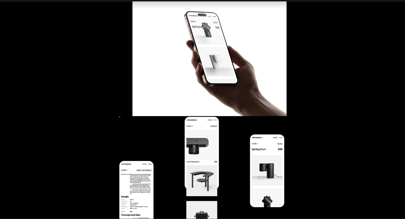
Project: Minimalissimo (Source: Behance)
Here’s why minimalism will dominate in 2026:
- Brains love simplicity.
- Gitte Lindgaard’s research shows users form opinions about your site in just 50 milliseconds. Overcomplicated layouts? Bye-bye retention.
- Gitte Lindgaard’s research shows users form opinions about your site in just 50 milliseconds. Overcomplicated layouts? Bye-bye retention.
- Cognitive load is real.
- Every extra visual element adds friction. Minimalist interfaces lighten the mental load, making apps feel effortless.
- Every extra visual element adds friction. Minimalist interfaces lighten the mental load, making apps feel effortless.
- Less is memorable.
- Look at Spotify’s interface: clean layout, intuitive controls, no clutter.
- Look at Spotify’s interface: clean layout, intuitive controls, no clutter.
365 million active users later, it’s proof that simplicity drives engagement.
And yes, minimalism isn’t just for screens. Logos and branding are getting the minimalist treatment too. Custom typography, subtle ligatures, and tiny details in simple wordmarks give brands readability and awareness.
The key features of this trend
- Clarity: Users don’t have to hunt for what they need.
- Aesthetic punch: Simple doesn’t mean boring. Think sleek, modern, and confident.
- Cognitive load management: Every element either reduces mental effort or gets cut.
- Memorability: Minimalist elements stick because they’re not fighting for attention.
- Progressive complexity: Interfaces that reveal depth only when users need it.
Hot tip
Strip down your interface like you’re decluttering your desk. Keep the essentials. Play with whitespace like it’s a design element in itself. And don’t just “remove stuff.” Make sure every element earns its spot.
2. AI-First Design
McKinsey research shows AI could add $4.4 trillion in productivity growth potential, but only if humans stay in the driver's seat. By 2026, AI will become your design partner who never complains, never misses a deadline, and doesn’t roll their eyes when you ask for the fifteenth iteration.
Designers won’t spend hours nudging auto-layout boxes or tweaking tiny spacing. Instead, they will curate, refine, and strategize. AI will handle the grunt work (layouts, color palettes, even entire branding systems), while humans will focus on creativity, context, and intuition.
And tools like Galileo AI, Uizard, and whatever Figma acquires will be there to help them out.
Here’s why AI-first design matters:
- Speed without sacrificing quality.
- AI can generate dozens of design options in minutes, letting you test ideas faster than ever.
- AI can generate dozens of design options in minutes, letting you test ideas faster than ever.
- Collaboration, amplified.
- Think of AI as a junior designer who never gets tired. Your role is guiding, correcting, and curating the best outputs.
- Think of AI as a junior designer who never gets tired. Your role is guiding, correcting, and curating the best outputs.
- Creative freedom:
- With repetitive tasks automated, you get to focus on high-level decisions and unique touches that AI can’t invent… yet.
- With repetitive tasks automated, you get to focus on high-level decisions and unique touches that AI can’t invent… yet.
Think about it this way: A junior designer might spend 3 hours creating 5 layout variations. AI creates 50 variations in 3 minutes. But only a skilled designer knows which of those 50 is worth pursuing and why.
The key features of this trend
- Prompt-driven creativity: Design briefs like "Make this 20% more accessible for Gen Alpha users" are now legitimate project requirements.
- Intelligent iteration: AI generates variations faster than you can say "can we try this in blue?"
- Strategic focus shift: Designers are being evaluated on their prompting skills and creative direction.
Hot tip
Embrace it, but keep your human touch front and center. Treat AI like a junior designer who’s ambitious but clueless. Guide it, correct it, and don’t let it go rogue, otherwise, you’ll end up with a 6-step onboarding for a calculator. Use it to test, iterate, and spark ideas, but never let it replace your design instincts.
3. Voice Interfaces
Back in the day, voice assistants like Alexa sounded like robots who just discovered English: awkward and all wrong. But now? Thanks to smarter natural language processing, voice interfaces have finally grown up. They’ve become go-to for apps in smart homes, cars, and wearables. It won't be about screens anymore by 2026. It will be about thinking beyond visuals. And the real breakthrough won’t be voice-only experiences, it's multimodal design where voice and visual elements create something neither could achieve alone.
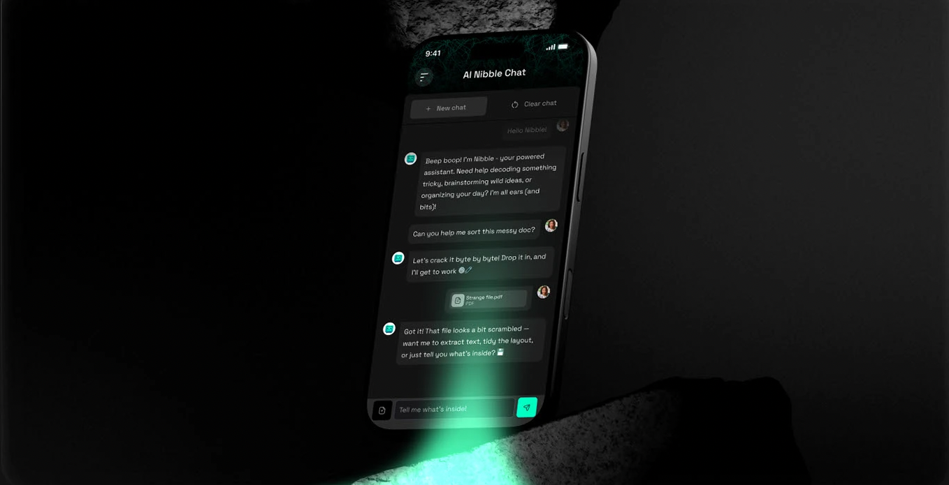
Project: Nibble (Source: Behance)
Here’s what makes voice interfaces a big deal:
- Seamless interaction.
- Combine voice with visual feedback so users know the app “gets it.”
- Combine voice with visual feedback so users know the app “gets it.”
- Hands-free life.
- Cooking, driving, even parenting. Voice enables multitasking like nothing else.
- Cooking, driving, even parenting. Voice enables multitasking like nothing else.
- Personality counts.
- Assistants with quirks or subtle charm make interactions enjoyable, not robotic.
- Assistants with quirks or subtle charm make interactions enjoyable, not robotic.
Think about how you use voice interfaces. You're not having philosophical discussions with Siri. You're asking for directions while driving or controlling music while your hands are full. Voice interfaces excel at hands-free interaction when physical interaction isn't feasible.
The key features of this trend
- Accessibility: Voice opens your app to users with disabilities or limited mobility.
- Convenience: Nothing beats asking for what you want and getting it instantly.
- Engagement: Conversational flows hook users more than static clicks ever could.
Hot tip
Not every app needs to shout at users. Design voice interactions with intention: quiet, clear, and respectful. And don’t forget to always include an easy “off” button, because not everyone wants a chatty app all the time.
4. Zero UI
Gartner predicts 70% of customer interactions will involve emerging technologies like voice assistants and computer vision by 2026, but most companies are still obsessing over button colors.
Screens are overrated. Seriously. By 2026, the coolest interfaces will be the invisible ones. We’re talking about tech that reads the room, guesses your moves, and gets stuff done without you lifting a finger or swiping a screen. Creepy? A bit. Convenient? Absolutely.
Imagine a fridge that knows you’re low on milk and just orders it. Or a car that adjusts your seat and mirrors the moment you hop in because it recognizes your face.
The shift isn't about getting rid of screens entirely. It's about making technology so contextually aware that interaction becomes effortless.
Here’s why it’s a big deal:
- Invisible interactions.
- Users don’t need to think about the interface, they just experience it.
- Users don’t need to think about the interface, they just experience it.
- Feedback beyond visuals.
- Audio cues, haptic responses, and subtle behavioral nudges replace traditional screens.
- Audio cues, haptic responses, and subtle behavioral nudges replace traditional screens.
- Context is king.
- Devices understand where you are, what you’re doing, and adjust automatically.
- Devices understand where you are, what you’re doing, and adjust automatically.
Think about Tesla's approach to car interfaces. The car adjusts your seat position based on facial recognition. It preheats itself because it knows your schedule. It routes you home without being asked. The interface isn't gone. It's everywhere and nowhere.
The key features of this trend
- Convenience: Experiences feel effortless, almost futuristic.
- Engagement: Users stay hooked because the product “just works” without friction.
- Innovation playground: Designers get to rethink everything about interaction, not just pixels on a screen.
The psychology behind
User experience design that prioritizes human cognitive capabilities and behavior reduces what researchers call "decision fatigue." Every button you don't have to press, every menu you don't have to navigate, every choice you don't have to make preserves mental energy for what actually matters.
Hot tip
Prototype for experience, not interface. Step into the real world and watch how people actually move, speak, and interact. Make the interface so invisible that users forget it’s even there. And yes, test it. Often. In messy, real-life scenarios, not just a tidy Figma mockup.
5. Neumorphism and Soft UI
Classic neumorphism is pretty, but it's problematic. You know the look: those soft, pillowy buttons that seem to float just above the surface. It was everywhere in 2020, then designers realized something uncomfortable: beautiful interfaces that people with visual impairments couldn't actually use.
The concept didn't die. It evolved.
What we're seeing in 2026 isn't traditional neumorphism. It's what they call "Soft UI," interfaces that give digital elements a subtle 3D vibe and capture the tactile appeal of neumorphism while being usable by humans.
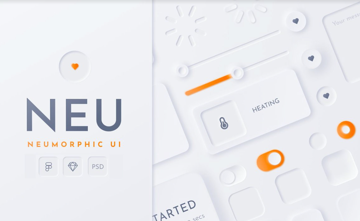
Neumorphic Soft UI Kit (Source: Behance)
Here’s why designers are excited:
- Depth without clutter.
- Soft shadows and highlights make interfaces feel tangible without adding visual chaos.
- Soft shadows and highlights make interfaces feel tangible without adding visual chaos.
- Intuitive interactions.
- Elements mimic physical objects, so users instinctively know where to tap, swipe, or drag.
- Elements mimic physical objects, so users instinctively know where to tap, swipe, or drag.
- Modern meets classic.
- It blends minimalism with a touch of realism—clean, elegant, and surprisingly engaging.
- It blends minimalism with a touch of realism—clean, elegant, and surprisingly engaging.
Look at how Samsung uses subtle neumorphic effects in their Galaxy interface. The elements feel tactile and engaging, but they never sacrifice clarity for aesthetics. Buttons look like buttons. Interactive elements are obviously interactive.
The key features of this trend
- User engagement: People linger longer when interfaces feel approachable and alive.
- Aesthetic value: Gives your UI a subtle “wow” factor without going overboard.
- Intuitiveness: Users navigate naturally because your interface feels familiar, like touching real buttons in a digital world.
The psychology behind it
Humans are wired to understand physical objects. We know how to press buttons, flip switches, and slide controls because we've been doing it our whole lives. Neumorphism creates a subtle and realistic look that's both modern and nostalgic, tapping into these deep-seated interaction patterns.
Hot tip
Less is more. Use Neumorphism for key touchpoints, not the whole app. Pair it with flat elements for contrast, and don’t let shadows overpower clarity. It’s about a soft nudge, not a 3D explosion.
6. 3D and Spatial Design
By 2026, digital design is getting dimensional. Thanks to devices like Apple Vision Pro, Meta Quest, and even upcoming Samsung gadgets, designers are thinking in space, not just screens.
This trend is about making interfaces feel alive. Real depth. Interactive elements. Interfaces that respond, move, and react like physical objects in the user’s space. And the numbers back this up: 3D elements on websites can increase time on page by up to six times.
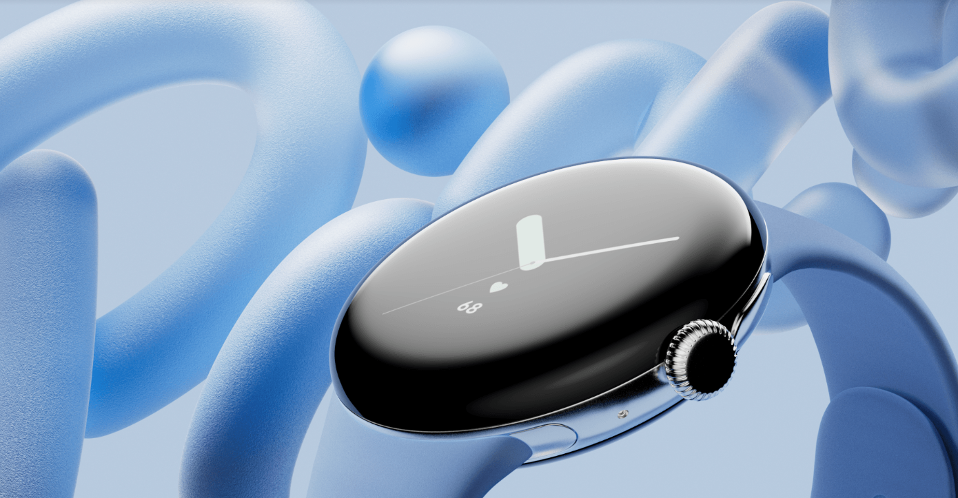
Project: Google Pixel 8 (Source: Behance)
Here’s what’s happening:
- Responsive 3D elements.
- Cards, buttons, and menus that subtly shift with cursor or touch movements.
- Cards, buttons, and menus that subtly shift with cursor or touch movements.
- AR experiences beyond headsets.
- Product previews, immersive design tools, spatial layouts: – you can explore 3D even on a phone or tablet.
- Product previews, immersive design tools, spatial layouts: – you can explore 3D even on a phone or tablet.
- Spatial storytelling.
- Interfaces that guide users through a “space” rather than just a screen. Movement, depth, and layering matter as much as color and typography.
- Interfaces that guide users through a “space” rather than just a screen. Movement, depth, and layering matter as much as color and typography.
Look at how companies like Framer and Spline are making 3D web experiences accessible to designers without coding backgrounds. Or consider how eCommerce sites are using AR previews to let customers see products in their actual space before buying.
The key features of this trend
- Engagement: Interactivity makes users linger, explore, and remember your interface.
- Intuition: 3D cues mirror the real world, making navigation feel natural.
- Future-proofing: Spatial thinking prepares your designs for mixed-reality experiences.
The psychology behind it
Think about how your brain processes physical space. You instinctively understand that objects closer to you are more important. You know how to navigate around obstacles. You expect things to respond when you touch them. Dimensional design taps into these deep-seated spatial intuitions.
Hot tip
Design your next interface like you're creating a physical space that users will walk through. Map out the user journey as if it's a floor plan.
- Which elements should feel "closer" to grab attention first?
- What should feel "further away" to reduce clutter?
- Where would users naturally look first, second, third?
But remember: smooth beats flashy. A polished 2D flow is better than a laggy 3D rollercoaster. Keep it performant, keep it delightful.
7. Anti-Design 2.0
Anti-Design 2.0 is ugly, messy, chaotic… and surprisingly magnetic. Think portfolio sites, edgy brands, and apps that refuse to look like a cookie-cutter template. It’s not “bad design”; it’s design that dares to break the rules, intentionally.
This trend is all about embracing imperfection as a style. Oversized elements? Check. Clashing colors? Double-check. Text overlapping images? Absolutely. And somehow, it still feels right, because it’s authentic, bold, and memorable. Also before layering text on photos, you can remove image background first to isolate subjects and create that raw, intentional look.
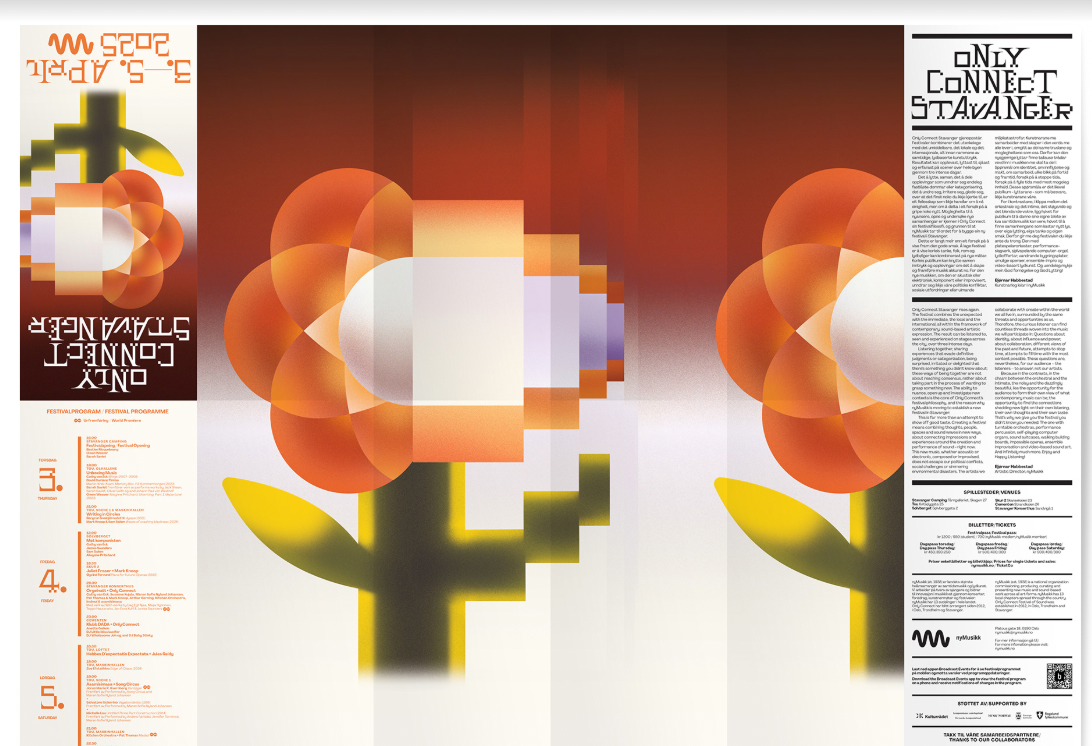
Project: Only Connect Stavanger (Source: Behance)
Here’s what makes Anti-Design 2.0 tick:
- Imperfection as identity.
- Users crave authenticity, and this style screams “we’re human, not a corporate machine.”
- Users crave authenticity, and this style screams “we’re human, not a corporate machine.”
- Breaking monotony.
- In a sea of identical portfolios and apps, chaos stands out.
- In a sea of identical portfolios and apps, chaos stands out.
- Rule-breaking done intentionally.
- Every weird decision is purposeful, not random.
- Every weird decision is purposeful, not random.
The key features of this trend
- Engagement: People crave real, raw, and unexpected design vibes, not just polished perfection.
- Standing Out: When everything looks the same, chaos becomes the spotlight.
- Authenticity: It’s a design rebellion that connects emotionally. Users linger longer when something surprises them visually.
Hot tip
Messy doesn’t mean meaningless. Use this trend wisely. If you’re designing a bank or medical app, maybe don’t go full Comic Sans with wiggly buttons. But for portfolios, creative apps, or edgy brands? Let your pixels misbehave a little. Test, iterate, and make sure your chaos still tells a story.
8. Motion Posters
Static visuals are… fine. But in 2026, still images alone aren’t enough. Motion posters are here to bring your designs to life. Think subtle loops, tiny animations, and micro-movements that grab attention. With an animated video maker, designers can easily transform these motion posters into short, eye-catching clips without needing complex video editing skills.
With an animated video maker, designers can easily transform these motion posters into short, eye-catching clips without needing complex video editing skills. When motion posters promote longer-form recordings, including podcasts, webinars, or conference sessions, an AI video clip generator handles the other half, pulling the most impactful moments from the full recordings into short, social-ready clips with minimal manual editing.
These aren’t full-blown videos. They’re animated visuals that feel alive, perfect for social media, events, or digital campaigns. Designers can make these animations feel even more immersive by using AI motion control tools to add smooth camera movements, such as subtle pans and zooms, that guide viewers' attention without distracting from the overall design. Why should you care? They tell a story in motion, keeping users engaged just long enough to make an impact.
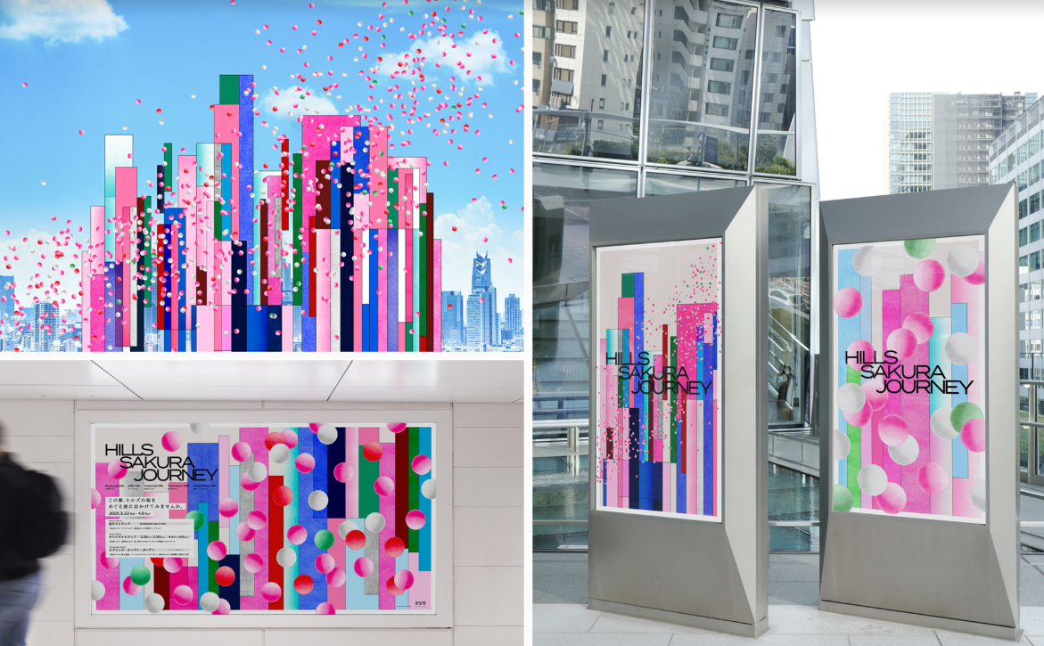
Project: Hills Sakura Journey (Source: Behance)
Here’s why this trend matters:
- Attention magnet.
- Our eyes are drawn to movement. Even small loops or hover effects make users pause and explore.
- Our eyes are drawn to movement. Even small loops or hover effects make users pause and explore.
- Brand storytelling.
- Motion lets your visuals communicate personality, mood, and context in seconds.
- Motion lets your visuals communicate personality, mood, and context in seconds.
- Versatile & lightweight.
- Unlike full videos, motion posters are quick to load, shareable, and perfect for web or social.
- Unlike full videos, motion posters are quick to load, shareable, and perfect for web or social.
Look at how Netflix uses motion in their interface. Movie posters come alive when you hover, giving you a taste of the content without playing the full trailer. Or consider how Stripe's homepage uses subtle particle movement to suggest data flow and connectivity.
The key features of this trend
- Eye-catching: Movement naturally draws the eye—use it to make your message stick.
- Balance: They’re dynamic but not overdone. Just enough motion to be memorable, not annoying.
- Storytelling: Great for launches, promos, or just making your branding pop on social feeds.
The psychology behind it
Our peripheral vision is specifically designed to detect motion through rod-shaped photoreceptors in the human retina. Motion posters exploit this biological reality to create content that's literally impossible to ignore.
Hot tip
Don’t overdo it. Subtlety wins. Loop animations should feel natural, not dizzying. Use it to highlight, guide, or emphasize, not distract. If you do not want to use social media, Viewri can help browse social media content privately without leaving traces or logging in.
9. Responsible Glassmorphism
Imagine frosted glass… now imagine it on your screen. That’s Glassmorphism: translucent surfaces, blurred backgrounds, subtle layering, all wrapped in a sleek, futuristic aesthetic. By 2026, this style is a way to add depth and hierarchy without cluttering your interface.
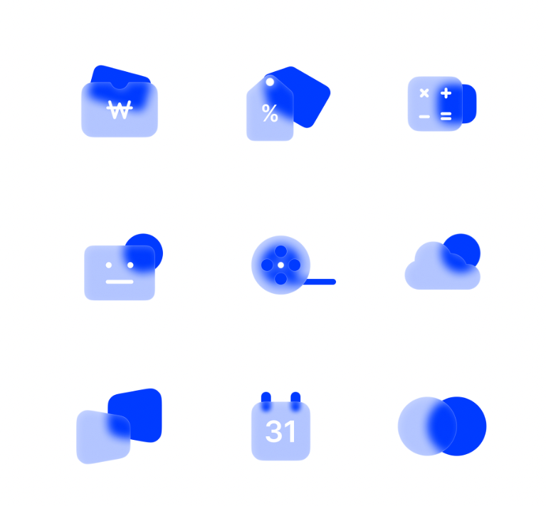
Project: Glassmorphism Icons (Source: Behance)
Why it’s worth a spot on your radar:
- Visual hierarchy.
- Blur and transparency guide the eye naturally to key content.
- Blur and transparency guide the eye naturally to key content.
- Depth without distraction.
- Elements feel layered and tactile, but the interface remains clean and readable.
- Elements feel layered and tactile, but the interface remains clean and readable.
- Modern polish.
- It gives apps and brands a premium, futuristic vibe without overcomplicating things.
- It gives apps and brands a premium, futuristic vibe without overcomplicating things.
Look at how Apple uses glassmorphism in iOS. Notice how their glass effects never compromise text readability? Critical interface elements maintain high contrast while decorative elements use subtle transparency. That's responsible glassmorphism.
The key features of this trend
- Depth & Layers: Makes flat designs pop with a cool 3D-ish feel.
- Polished & Professional: Perfect for financial apps, SaaS, and corporate vibes where trust and cleanliness matter.
- Subtle & Simple: Keeps things sleek without turning into a visual mess.
Hot tip
Don’t drown everything in frosted glass. Use it strategically to highlight important elements or separate layers. Pair it with bold typography and subtle shadows to maintain contrast and legibility.
Remember: elegance is in the restraint, not the blur.
10. Fluid Typography
Typography isn’t just letters on a page anymore. In 2026, typography is becoming as dynamic as the users reading it. We're talking about text that adapts, responds, and strengthens the user experience.
Marketers report a 30% increase in consumer engagement when using brand-consistent fonts, but that's just the beginning. Variable fonts enable many different variations of a typeface to be incorporated into a single file, rather than having separate font files for every width, weight, or style. They also allow type to smoothly scale, shift, and morph across devices and screen sizes. And yes, it can react to scrolling, hovering, or even voice commands.
Why you’ll want this in your toolkit:
- Responsive by design.
- Typography adjusts automatically for different screens, contexts, and user preferences.
- Typography adjusts automatically for different screens, contexts, and user preferences.
- Interactive engagement.
- Text can animate, transform, or respond to actions, making content feel playful and alive.
- Text can animate, transform, or respond to actions, making content feel playful and alive.
- Hierarchy made simple.
- Dynamic sizing and spacing guide users naturally through your content.
- Dynamic sizing and spacing guide users naturally through your content.
Think about how Medium adjusts line height and font size based on your reading behavior. Or how Stripe's interface uses typography hierarchy that shifts based on the complexity of the information being displayed.
The key features of this trend
- Contextual Adaptation: Typography that adjusts not just to screen size, but to reading distance, ambient light, and user preferences.
- Interactive Responsiveness: Text elements that respond to scrolling, hovering, and user interaction in ways that improve comprehension.
- Performance-Smart: Variable fonts combined with CSS custom properties and calculations create robust, scalable typographic systems that load faster and render better
The psychology behind it
The breakthrough is also psychological. When typography responds to user behavior, it creates a sense of dialogue between the reader and the interface.
Hot tip
Design your typography like you're creating a conversation. Start with your body text and make it perfect for sustained reading. Then work outward to headers, captions, and UI elements. Most designers start with the flashy display type and end up with body text that's painful to read. Flip that process: nail readability first, then add personality.
11. Ethical Hyper-Personalization
71% of consumers expect personalized interactions, and 76% get frustrated when this doesn't happen. By 2026, one-size-fits-all is dead. Users want experiences that feel custom-built: their preferred colors, habits, even subtle quirks. But don’t worry, they don’t want your app to creep them out.
Hyper-personalization is about smart, context-aware design. Apps anticipate needs without being intrusive. Think dashboards that adjust when you’re tired, onboarding flows that match skill level, or themes that switch automatically at night.
Here’s what makes it tick:
- Context matters.
- Interfaces adapt to time of day, device, or user behavior.
- Interfaces adapt to time of day, device, or user behavior.
- Tailored onboarding.
- Newbies get guidance, pros skip straight to action.
- Newbies get guidance, pros skip straight to action.
- Power to the user.
- Let users tweak settings and personalize at their own pace.
- Let users tweak settings and personalize at their own pace.
Look at how DuckDuckGo personalizes search results without tracking users, or how Signal provides personalized features while maintaining end-to-end encryption. These brands are setting the bar for trust-first UX.
The key features of this trend
- Engagement: Users stick around longer when the experience feels made for them.
- Satisfaction: A tailored flow reduces friction and boosts confidence.
- Brand loyalty: People remember apps that “get” them.
Hot tip
Give control, but keep it playful. Let users explore personalization options, but don’t force data-sharing just to unlock features. Make it feel like your app wants to help, not spy.
12. Neurodiversity, Inclusivity, and Accessibility
1 in 5 people in the world experience products differently. Accessibility isn’t a “checklist” anymore. By 2026, UI/UX is about people, not just pixels. We’re designing for the full spectrum: ADHD, autism, dyslexia, neurodivergent brains, and yes, everything in between.
It’s more than color contrast or screen readers. It’s about how information is structured, how notifications behave, and how mental load is reduced. Inclusivity is baked into the product, not tacked on as a mode or toggle.
Here’s what makes it tick:
- Optional minimalist modes.
- Strip away noise for users who need focus.
- Strip away noise for users who need focus.
- Motion-aware interfaces.
- Animations that respect motion sensitivity, keeping interactions comfortable.
- Animations that respect motion sensitivity, keeping interactions comfortable.
- Respect for attention.
- No more 7 pop-ups in a row. Interfaces that honor mental bandwidth.
- No more 7 pop-ups in a row. Interfaces that honor mental bandwidth.
Look at how Discord implements focus modes that strip away visual noise, or how iOS offers motion sensitivity controls that respect users' neurological differences. These aren't add-on features. They're core design principles.
The key features of this trend
- Cognitive Inclusion: It’s designing for all kinds of brains, not just the “average.”
- Mindful UX: Interfaces become intuitive, reducing frustration for everyone.
- True Accessibility: Alternative inputs, thoughtful animations, and respecting user focus. It’s about dignity in design.
- Wider reach: Products work for more users, including those with disabilities.
Hot tip
Don’t just “add an accessibility mode.” Test your designs with real neurodivergent users. Build inclusion into your core UX from day one. Follow standards like WCAG, but go beyond, observe how people interact in real-world scenarios. Think of it as designing for the human, not the average user.
See how top UI/UX designers joined Fishbrain through Index.dev, building a great fishing app and growing their careers.
Wrapping Up
UI/UX in 2026 is about understanding people, technology, and the world they live in. From minimalist layouts that calm the mind, to 3D & spatial design that pushes your flat screens into real space, to dynamic fonts that wake your text up, the trends we’ve covered are responses to real human needs.
What this tells you as a designer:
1. People first
Every interaction, animation, and layout should solve a real problem. Users notice, even subconsciously, when a design respects their attention, time, and abilities.
2. Tech smart
AI, motion, 3D, and voice interfaces are the tools to amplify creativity, strengthen workflows, and create experiences that feel alive.
3. Ethics & empathy
Hyper-personalization, accessibility, and sustainable design are the new baseline for good UX. Ignoring them is bad business.
A minimalist app can be hyper-personalized. AI-generated layouts can be sustainable. Voice and zero UI can coexist. Your job is to make users feel understood, empowered, and delighted.
And please don’t chase trends for the sake of looking “cutting-edge.” Instead, pick what aligns with your users, your product, and your brand story. Experiment boldly, test ruthlessly, and remember:
The best design isn’t seen, it’s felt.
Level up your career! Join Index.dev and get matched with global companies building the future of UI/UX design.
